Go Back
Oil paintings
Completed in my Beginning Painting class December 2004:
M: Part two of final project - self as persona. I decided to paint myself as Agent M from Tsunami Bomb. It was hard to paint without my glasses on! I couldn't really see. Comments varied. I don't make such a great M. CURRENT STATUS: In bedroom closet at home.
Nosferatu: Part three of final project - self with black and white movie still in background. I used a scene from Nosferatu. Many people said that it doesn't look like me and I agree. However it's my favorite out of the three. CURRENT STATUS: Displayed in my bedroom at home.
Dogbird: Light still life - bone and cup on table in front of a covered block. Compared to the dark still life, I didn't like this one too much. The bone in front is cool though. It's not a bad painting. CURRENT STATUS: Displayed in garage at home.
Lady: Dark figure. A model named Amy posed for us. My teacher really liked it. I think it's alright, maybe I could have put in more detail but there was not enough time. CURRENT STATUS: Displayed in garage at home.
Clown: Light figure. Another one of Amy but done entirely with a palette knife! It was tough to just slab on the colors. I still like working with a small brush. It turned out great except she looks like a clown. CURRENT STATUS: Displayed in garage at home.
Donuts: Still life of real donuts. Regular donuts make me throw up unless they are vegan. The background needs more work but this was one of my first paintings. The donuts look good but my teacher said to not use pure white. CURRENT STATUS: Displayed inside home.
Nevermore: Dark still life - A stuffed raven on a fake tree in front of a draped block. I really liked this one but my teacher said I needed more work on the back drape. CURRENT STATUS: Displayed in garage at home.
Still life: A napkin, glass scraper, and my keychain light and student ID on a table. I did not want to paint the details of my student ID. The napkin looks more like a wallet. I don't care for this one too much. CURRENT STATUS: Given for free to my best friend, Rosa.
First: This was my first painting of a garlic on top of a light background and an onion on top of a dark background (half of a magazine page with an Asian model on it). It's not very good, and you can't really differentiate the fields. CURRENT STATUS: Displayed in garage at home.
Me: My first self portrait. I took up the whole screen and the professor liked it. I don't know what that stain is near my mouth though, but my mom says it looks like I have epilepsy, but I really don't. CURRENT STATUS: In my closet at home.
Henri: Copy of Robert Henri's Portrait of a Smiling Boy. It turned out fine but his face is a bit distorted. People liked that. It is kind of creepy. CURRENT STATUS: Displayed inside near front door at home in a fancy golden frame.
The Great Outdoors: We created tonal drawings outdoors and came back to the studio using any colors we wished in our painting. I used many complementary colors here. CURRENT STATUS: Hung in downstairs unit living room at home.
Spooky: This was a collage based on the still-life I would use for our final project. It is one of my favorites. I guess it doesn't really fit under the category of 'Oil Paintings' but I don't do many collages so it was placed here. Plus, the actual oil painting is the last one listed under this category. CURRENT STATUS: Displayed in guest room at home.
Marks: This is an abstract experimenting in mark making. CURRENT STATUS: In art portfolio.
Robert: A figure painting of an elderly and well known model. CURRENT STATUS: In bedroom closet.
Girl: A figure painting of a young student/model. CURRENT STATUS: In bedroom closet.
Split Personality: This was my final project for this class: a large 3 feet by 4 feet abstract painting based on a still life my group set up. CURRENT STATUS: Hung in main area of home.
Acrylic paintings
Completed in March 2005.
CURRENT STATUS: All placed in art journal/portfolio inside my bedroom closet at home unless otherwise noted.
Magritte: Copy of a portion of Rene Magritte's work. It was our final assignment. There were a lot of great pieces of his to choose from but I decided to do this one. The woman looks somewhat manly but I like the blood.
Landscape: People compared this to Monet! It also looks kind of Asiany. It could use a bit more paint though. This is a view of the Arboreteum in Davis.
Nude: Still life of a nude sculpture, violin piece, and some other things. It's pretty nice.
Point: Still life using Seurat's pointilism technique. My brush point was too big so it looks more Impressionist. Still a beautiful painting though.
Darkness: I did this for extra credit. It's supposed to be abstract. It looks like it's all black but when you move it around you can see all these other colors. CURRENT STATUS: Displayed near my mini toy collection in my bedroom at home.
Rosa: This is how I see my best friend. Explanation hidden. CURRENT STATUS: Given to my best friend as a birthday gift.
Stars All Over: The City Drive are my heroes. Here's the difficulty level: Marc > Scotty > Danny > Chris. I knew beforehand that Chris would be the easiest to draw because his facial features are just so strong, and from the first day, Chris already looked like Chris. I'm not so pleased with Marc and Scotty, but at least you can tell who's who. This work took me the longest I've ever worked on a painting before (well so far, I still have the other 3/4 of the heroes project to complete and 1/2 are going to take forever). I worked on this for 4 days for around 11 hours. There's a hidden message here. If you figure it out, you should get a prize. I considered working on this more. CURRENT STATUS: In bedroom closet.
CURRENT STATUS: All placed in art journal/portfolio inside my bedroom closet at home unless otherwise noted.
Plates: We had to do five quick paintings of the same still life used later for a longer oil painting. CURRENT STATUS: Stacked in my closet.
Two Like One: This is part one of three Joseph Albers' experiments, where two colors are made to look like one by changing the color surrounding it.
One Like Two: Part two where I make one color look like two.
Triangles Color Quantity: The colors do not look that different here despite the different placement so I worked with squares next.
Squares Color Quantity: This one concludes the Albers' projects.
Luna Trigger: Probably my favorite Kamen Rider W combination. Two mini panels aligned together. I plan to do the same for Cyclone Joker and Heat Metal. KR is taking over the world! CURRENT STATUS: Luna displayed in CD stand; Trigger given to my aibou, Nina.
Photography
Done in spring and summer 2005.
CURRENT STATUS: All saved on a floppy disk. Yes, a floppy disk, if you still know what that is.
Please note. I have taken black and white photography class but have not had the time to scan my photos to post them here.
Money Talks: I thought this was funny so I took a picture of it. The speech bubble is actually from a picture I took of myself for Threadless.
View from a window: This is a view from my house window. Isn't it beautiful? There's an adult school down there and far off in the distance are cemeteries and the mountains as well as other houses and trees of course!
Ideas: There's something fishy going on here. I just thought the picture and the secret was a clever idea so I did it. The light bulb was there first then I bought the postcard of Rodin's The Thinker.
Sculpture
Done in summer and fall 2005:
For Mommy: This was done during my senior year in 2003 as a Mother's Day present. Inside the container is a black Weezer shirt, a pan with food inside, a plate, and a cell phone. My mom provides me with clothes, food, and often calls me on my cell when I am out to check on me. CURRENT STATUS: Displayed in bed headboard shelf..
Middle Aged: This is my second bronze sculpture piece. It's a cross but the four arms look like cat paws. It looks old and cracked, but also beautiful. I did not put any patinas on it, but I did use powertools on it to get this sheen. It was sealed with wax and buffed. CURRENT STATUS: Displayed on bedroom nightstand
Preferred Drink: Our teacher asked us to make a relief piece that was important in our daily life. I was going to make an open Bible but I had already done a piece that was booklike. People really liked the texture and contrast in this piece as well as the words written inside. CURRENT STATUS: Displayed on a bookshelf in home living room.
The Bat: I used gouache for the color on this piece of unfired clay. CURRENT STATUS: Given as a gift to my friend, Henry.
Mod: This is my take on modern furniture. It's two tables and a beanbag chair. There's a pink bowl on the white table as well. The white table has three legs because it couldn't stand on two. I used goache and watercolor to paint these. CURRENT STATUS: Used as furniture for my Barbie dolls.
Mirror: When I visited museums this past summer, I found that Chinese mirrors were very beautiful. I tried to make a jade one here. This clay was fired and painted with acrylic. CURRENT STATUS: Displayed on nightstand at home.
Stone Age: This is another table I made that looks like it's from the Flintstones so it is appropriately named. This is unfired clay painted with acrylic. CURRENT STATUS: Composted as it was broken.
Old Cross: Before it was painted with acrylic, it looked more like a cookie. This piece was fired and I think it looked kind of old as it should be. CURRENT STATUS: Displayed on nightstand at home.
Crib: Looks kind of like a toilet, but is actually a crib for the Barbie doll babies, where it is currently being used. Really plain, although I painted it light blue. I almost didn't want to include it here.
Lucky Cat: I'm guessing this is in a box in the garage with my other rejected sculptures. 'MEW' is written on the plaque. Perhaps a bit too simple.
Spirals: I believe that this was inspired by another artist's work. It came out pretty well, but would probably look better painted.
I Remember Halloween: I made this out of two-part polyurethane foam, a plastic toy pumpkin I got while trick-or-treating last year, cardboard, cotton, and this plastic wire cincher (to close plastic bags like from the grocery) at a master class with Melissa Pokorny this fall. The idea took a while to think up, but the timing was perfect. It's sad that it will degenerate, just like paintings, in several years. There's also something that's supposed to be like a brain inside the pumpkin but looks nothing like it. CURRENT STATUS: Unknown, possibly kept in paper bag with the following.
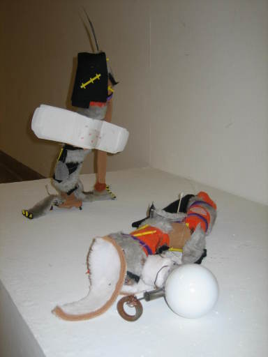
Murilegos: The idea for this project was to make something that I cared about or an experience or feeling I had. Murilegos means "cats" in Latin (accusative plural). It was made up of found objects: toilet paper rolls, children's Halloween costumes, rusty nails, lightbulb, feminine pad, Guess Who junk pieces, weird knicknacks, lots of special Elmer's glue, tape, broken jelly band, mini water bottle, thin foam sheet, one old battery, metal stuff, fallen feather, one q-tip, wire, and plastic string. Basically it reflects the dichotomic nature of cats. CURRENT STATUS: In a paper bag, not set up for display, in the garage although it was on display in the Art building lobby for a few weeks.
Drink A Little Water: The original photos were on a CD my teacher lost and someone stole one of the hands so I can only post one hand. The hands were made out of clear packaging tape and stripped water bottles (Aquafina and Kirkland). The "scarves" on top were made of various materials I cut and had sewn together (I made 60). Originally this project was set up in the Chemistry 194 building on a table for two weeks with two used notebooks and pencils in front. People were supposed to write down what they would like improved in the world and take a "scarf" as a reminder to carry out that goal. I also submitted the half hand only to the Earth Week Art show. CURRENT STATUS: Recycled while the many extra scarves are in a paper bag in the garage.
Color Pencil
Completed in March 2006:
Because We Are Girls (Tile Art): This drawing is based on the song "Sailor Team no Theme" and was inspired by the images I saw in the tiles of my apartment's bathroom floor. I originally made this to submit it to a contest here at school but it was rejected. Still, it's pretty. It is supposed to show femininity while promoting girl power, which is what Sailor Moon does! CURRENT STATUS: In art folder in closet.
Ryohei: I started this drawing like maybe a year ago but never finished it until this year. It still doesn't really look like him, but it's alright. CURRENT STATUS: In art folder, though it doesn't fit because it's too long.
Markers
Christmas Poster: This was quickly done since my dad needed help making posters to decorate his work. I made one and he made two. The art is based off a Christmas card. Completed in December 2007. CURRENT STATUS: USPS storage.
Lead gift: This was my gift to Lead but unfortunately I could not get any tickets to attend their Sendai concert this summer. Hopefully my friend will be able to put it in their gift box if she catches a concert. Akira is hard to draw and I am not happy with how he turned out. Shinya looks like he's Blackinese. Hiroki looks hot and Keita looks like himself. I really like the colors and design of this.
Storm: I drew this quickly one evening in my sketchbook after having a great idea the previous day. It was my contest entry to possibly be the card cover for an Arashi Secret Agency US card project. I drew inspiration from X-men's Storm and the Arashi cover art for their Dream "A" live CD. Completed in May 2008.
Hot Attack: I had this idea for a while and this took a while to complete. My only chagrin is that Yamamoto Yusuke looks like Akanishi Jin! I must redraw him separately. I tried to not miss anyone. I plan to draw a Domestic version.
Ikemen: A successful drawing of Yamamoto Yusuke! I think it looks like him.
Shepherds: Originally I did this in crayon but that was too late so I went over it with marker. It's amazing how I could blend the markers into the crayon. I learned a new technique! The art is based off a computer print out. Completed in December 2008. CURRENT STATUS: USPS storage.
Dracula: I wanted to paint this originally but was lazy so I used marker instead, my favorite media of choice! I think it has a comic-book feel to it which is cool.
Surprise: Since my friend got me into Kamen Rider with the Den-O series, I decided to draw this Imagin Anime cartoon for her as a gift.
Watercolor
Printmaking
Relief Prints completed in December 2006:
CURRENT STATUS: In two portfolios at my home.
Luna: This is the first reductive relief print I have ever done. It is a 4x6" body part self portrait of my arms. In the originally photograph, I am posing like Sailor Luna, hence the title. This was just a tester to get used to the process. (Linoleum)
Love: I did this one for fun and also because I did not like the one of my arms. I hope to make more of this print, each one with different colors. (Linoleum)
Folded Hands: This is my 5x7" body self portrait of my hands. I wanted to do my hands because I am an artist and use my hands a lot. Also I wanted to show how the tips of my fingers are curled up. (Linoleum)
Uprooted: This is a reductive multi-color print with art elements appropriated from a local painter, Gerald Heffernon. The colors used were a yellow-orange and blue. I actually entered this into the ArtisTREE auction and donated about 70% of my earnings. I made $18 on this. An additional copy was given to my language buddy, Sun, who took it back to Korea with him. (Wood)
STP: This one is an additive multi-color print on the environment. It looks like some sort of monument to recycling. I think there is too much black space at the bottom however. I used three colors: orange, sky blue, and black. STP stands for Save The Planet. (Linoleum)
Dinosaur Lady: This is the last project I did for my relief printmaking class. The theme was Freakshow/Circus for our print exchange. I did a reductive two-color (black and crimson red) linoleum print.
Leopard: I wanted to do cat's eyes but only one print turned out well. The other had watermarks. I used crayons again.
Keita: This was to show my new found appreciation of Japanese pop, in particular the group w-inds. Tachibana Keita is the main singer. Unfortunately it doesn't really look like him and also came up too dark. I have so many proofs. Touche is hard to print.
Ideal Landscape: This was a combination of crayon and touche and was fairly easy to print. I combined two images I found in a book from the lithographic studio.
Paradise: This was my last print, a combination of touche and crayon again. I was thinking of "New Paradise" by w-inds. when I was naming my prints. I found this image in another book from the lithographic studio and really liked it. It's a dark landscape with a cresent moon overhead.
Queen of Hearts: This was my first screenprint! It was pretty hard. I had different ideas for the 'after' but I really liked my professor's idea of playing cards, which also gave me ideas for my final project.
Half: The professor told me to try it in a different color like red.
Ryuichi: This was my second project "In the Manner of". The artist I chose was Kitagawa Utamaro. This is supposed to be like his close up bijinga (portraits of beautiful women) but I made it of a beautiful boy (Ogata Ryuichi from w-inds.) and used a similar color scheme. I wanted to use silkscreening for more practice instead of traditional woodblock printing. I believe that I submitted this print to be displayed in the art floor hallway as we were allowed to give one of our prints for the art department to keep.
Ryohei: Part 1/4 of my final project (Chiba Ryohei from w-inds.) I started with reductive relief again. I don't really like how this turned out because it did not align right but quite a few other people liked it. It's funny how I was more exact (line drawings) with screenprinting and sloppier (abstract) with relief when it should have been the other way around. I kind of want to do this again with silkscreen. Ryohei is hard to draw!
Triumphant: Part 2/4 of my final project - continuation of the playing cards. I like how his clothes are raggedy for a king. I used an Asian model for the guy.
Danny: Part 3/4 of my final project - continuation of playing cards. Danny Smith from The City Drive! I made his lips red because I combined Jack and Joker together into one card. It is interesting how I used celebrities for like all of my projects this quarter.
w-inds and THANKS: 4/4 of my final project. I originally tried to do two different versions (black and silver, black and blue) but the silver one came out so nicely by itself. I love it the most. I still have the block but there won't be as much detail if I try to make more prints now.
Go Back